
The Cognitive Aging Research and Education (CARE) Center wants to bring Alzheimer’s disease and related dementias (ADRD) education, support, and diagnosis to all Georgians no matter where they live. That’s why CARE partnered with the us to create a custom made website and an original Brain Health Video series. Our team used Figma, Wordpress with Elementor Pro Plugin, Premiere Pro and Envato to create these products.
CARE Center
Creating a website and video series that provides Alzheimer’s Disease and related dementias resources to all Georgians.
UX Designer & Researcher | Video Producer | UX Project Manager
UGA's Cognitive Aging Research and Education Center | August 2023 - May 2024
Within the rural and small communities of the state of Georgia, there are only 100 practicing geriatricians which means information about dementia and brain health can often be misunderstood or difficult to find. Simply put, rural Georgians lack access to healthcare resources that relate to ADRD and this inequity leads to poorer outcomes in regards to their health. The CARE Center wants to change that but, as of right now with no online presence, their reach is only to a handful of Georgia’s rural counties.
In order to solve the problem, we spent 9 months creating a digital footprint for the CARE Center. Our work focused on user research and testing, building a website from scratch and filming a video series.
User Experience Research Plan
Our team’s user experience research and testing journey began in October 2023 when we did preliminary user testing on our Figma prototype’s first iteration of the CARE Center’s website. This initial research informed who we designated as our target audiences. We identified our target audiences as the following:
Rural Georgians aged 65 and up who have been diagnosed with dementia
Those in the 25+ range serving primarily as caretakers
Those with a family history of dementia
People curious about ADRD
With our target audience parameters defined, we conducted user testing that included completing a series of tasks and detailed questions about the website’s design and usefulness. The data collected from these initial tests was valuable in that it provided concept validation and initial insights into user’s needs. Two of our key findings in concept validation were that none of the users tested had a go-to source for ADRD education and few visited competitor websites our team found while conducting market research.
With initial testing under our belt, we started building out our website and implemented changes — which will be discussed in the following section — suggested by our initial prototype testing. By mid-December 2023, our website was ready to undergo another round of user testing. However, we had to make a user experience research plan.
Our team’s goal in conducting the second round of user experience testing was to determine if the CARE Center’s website was user-friendly and easy to navigate when trying to find resources relating to ADRD.
The qualitative and quantitative methods used were customized for our target audience who we determined — through previous user research and user persona development — are likely busy, concerned with their or a loved one’s health, looking for guidance and may not be as familiar with using digital resources.
We recruited our target audience from previous users, word-of-mouth, client contacts in rural communities and online networks of people in the state of Georgia. We aimed for our sample to be mostly rural Georgians ranging in age, but leaning towards 40 and up. All that being said, we made note that due to our own geographical constraints and digital nature of the testing methods there was potential that it would skew less rural and younger than desired.
Despite our concern that the users we recruited would be outside our target audience, most users fit at least one area of the criteria. All interviews were conducted via Zoom. Participants completed a pre-test survey, pre-test questions, a series of tasks, Microsoft’s Product Reaction Cards and a post-test survey. We also used Microsoft Product Reaction Cards to gauge effectiveness of the video series. We measured the results of the tasks with a Success/Failure rate and the surveys were analyzed using attitudinal metrics. Any issues were categorized using severity ratings. The Product Reaction Card results for both the website and video series were communicated via word clouds.
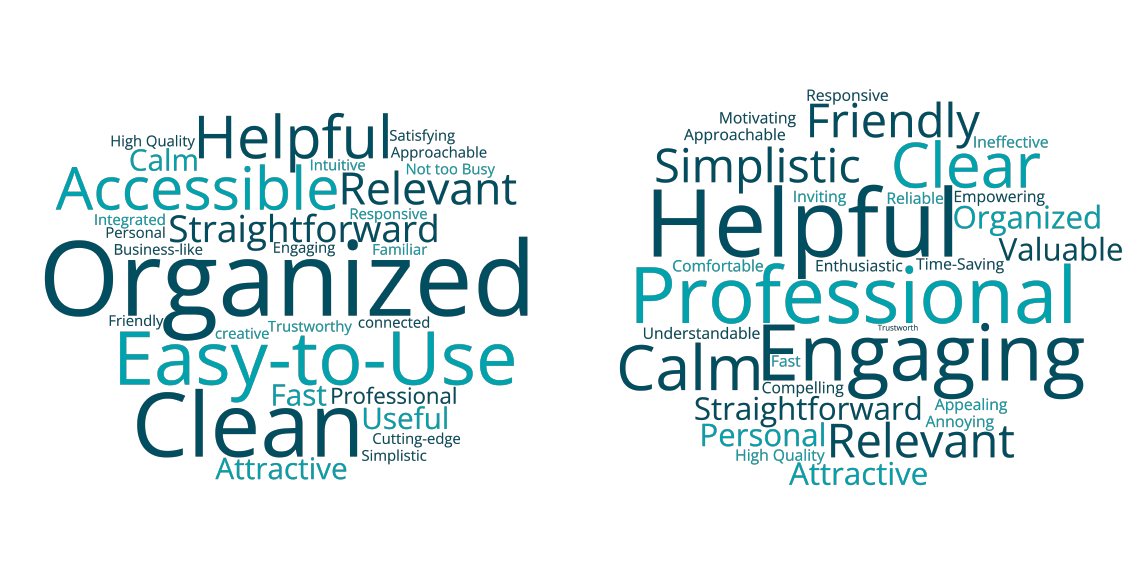
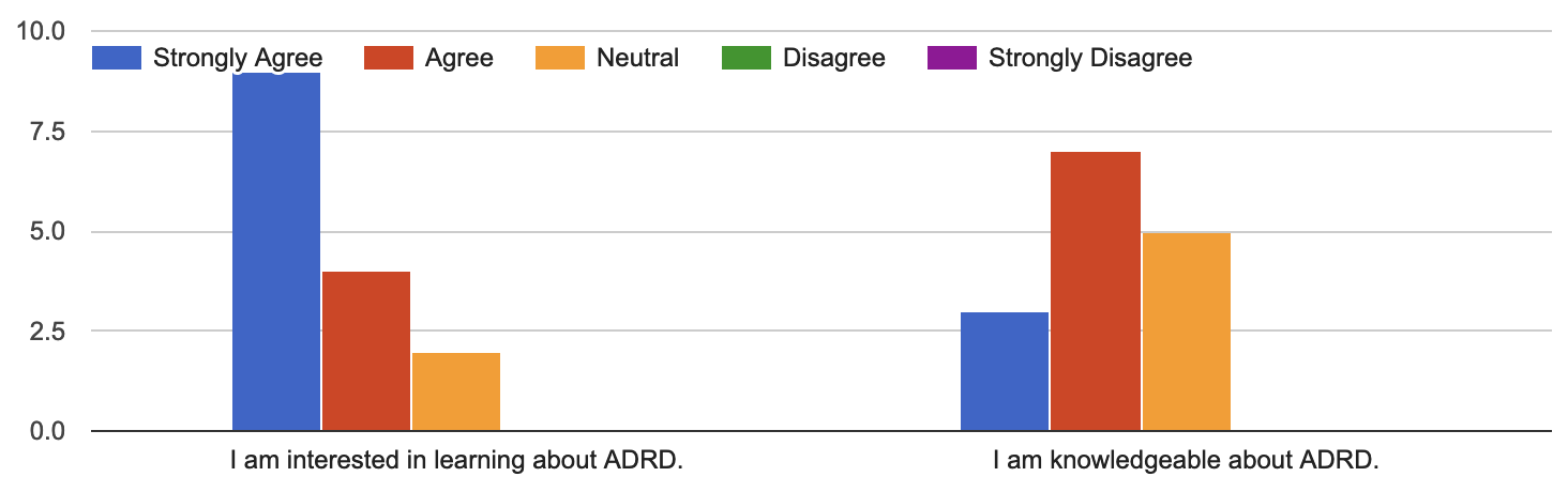
Our participant’s responses to the pre-test questions resulted in data that supported our desired sample pool. Participants ranged in age from 22–74, 46.2% had a connection to rural Georgia, and most either served as a caregiver or know someone diagnosed with dementia.
After compiling the data, we used insights from analyzing the quantitative and qualitative data to report the Average System Usability Score, positive findings and usability issues. The Average System Usability Score was 92.2 which is 24.2% higher than average according to usability.gov.
Our positive findings for the website included users finding its educational hierarchy and appearance clear and easy to navigate.
User Quotes:
“Not too busy. Like the Alzheimer’s Association website there so much you just get kind of lost. This one you do not.”
“…I haven’t spent a whole lot of time on the website, it seems like there are helpful tools especially from my perspective. My mother had dementia and so having a place where there’s specific support or education and the things that I thought about whenever she was being diagnosed.”
The positive feedback for our video series included users describing it as very professional and helpful.
“We’re more on a caption sort of world these days. This is sort of a captioned version of some deep science.”
“It gives you some sense of ‘Hey here are these different types of cognitive decline, but you know, it’s okay. You can call us or see a doctor’.”
Our top usability issues included: services CARE provides outside of education were unclear, users have their mobile devices' accessibility or zoom features turned on and no visual call-to-action on the video series. To alleviate these usability issues we proposed adding a page dedicated to CARE’s Clinic and their services, intalling an accessibility plugin so users can alter text size and put the CARE Center's web address in the Outro of the videos.
These insights were used to reinforce our ux design decisions with the client, make recommendations to the client or to improve the user experience through making changes. Although some of the solutions to the problems weren’t implemented due to the client’s request, we learned valuable information and were able to improve the user’s experience through minor adjustments.
Website
CARE’s plan for its already-existing website was to improve and eventually relaunch to include ADRD support, diagnosis, and education resources. By doing this, CARE is ensuring their organization has a digital footprint that furthers their mission and purpose. This website was their opportunity to expand to the rural communities of Georgia.
The CARE Center's landing page was hosted through WordPress. As a team, we agreed it would be best for the organization to continue using the hosting site for easy access and future modifications.
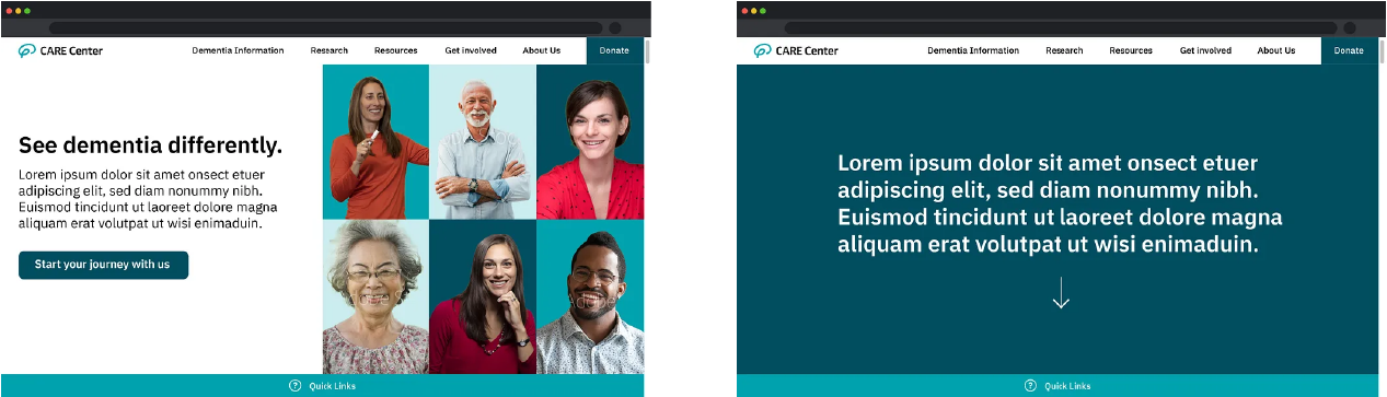
Before we were brought on, the CARE Team had already gone through a branding and basic card sorting exercise. They provided us with a few basic page design concepts and a layout for the website navigation, pictured below.
Our first order of business as a team was to look for inspiration for the new and improved CARE website. After researching some of CARE’s “competitors” and each of us finding design inspiration, we developed a prototype, using Figma, to create page layouts for the home, about, locations, and donations pages.
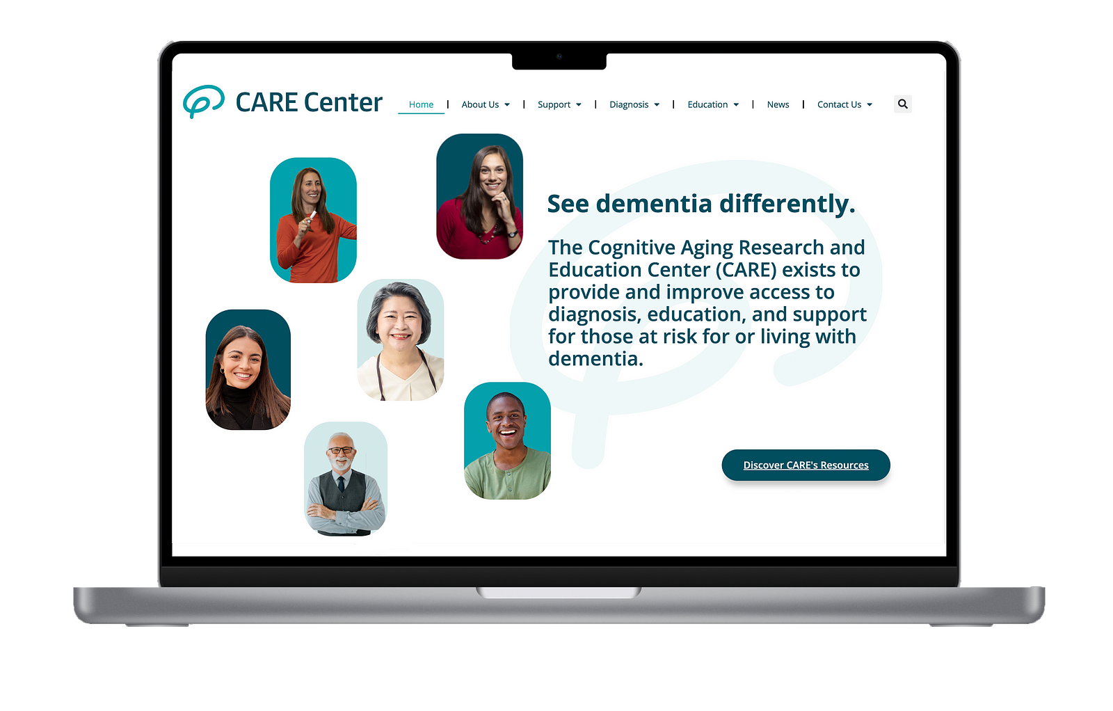
Keeping CARE’s branding for older adults in mind, we included an easy-to-read font, a selective color palette, and imagery to create a welcoming experience for users.
Throughout the process, we attended bi-weekly Zoom meetings with our clients to discuss expectations and to provide updates as we completed phases of the project. They gave us feedback on our prototype — and later the actual website — and provided us with content needed for the website pages. After gaining access to the CARE Center WordPress, our team had a major decision to make. What was the best way to design the website, exceed the expectations of our clients, and make it easy-to-navigate for the CARE team and the next NMI cohort?
We decided, as a team, the best option was to use a theme or plugin that would allow us to customize certain areas to fit CARE’s brand and to fill in the content they provided in a creative, organized manner. The plugin, Elementor Pro, allowed us to do just that. With elements like a custom footer and navigation bar, we were able to recreate pages similar to what was designed during the prototype stage.
By creating a site map, we were able to create a website layout and assign each team member the responsibility of designing specific pages. To maintain consistency, each content page and individual sections followed a template that includes elements like a hero banner with a cover image and background overlay, a table of contents, flip cards, and images. The content layout for the individual sections needed to be arranged in a way that followed CARE’s branding guidelines and was easy for users to process the information.
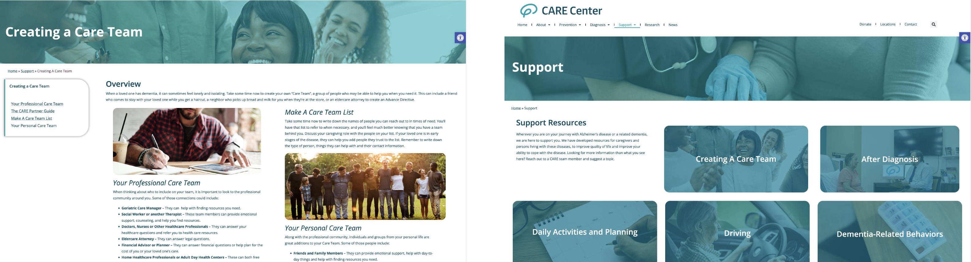
The next phase of our website development included conducting a second round of user experience testing — detailed in the previous section. Through this we were able to identify areas of UX design improvement by observing how people actually move through the website and recording test responses. In order to improve the user’s experience we increased the size of buttons, added the One Click Accessibility Plugin, added the CARE Center’s patient paperwork to the locations page and changed About Us to About. Along those same lines, we continued to refine the CARE Center website based on feedback from our clients.
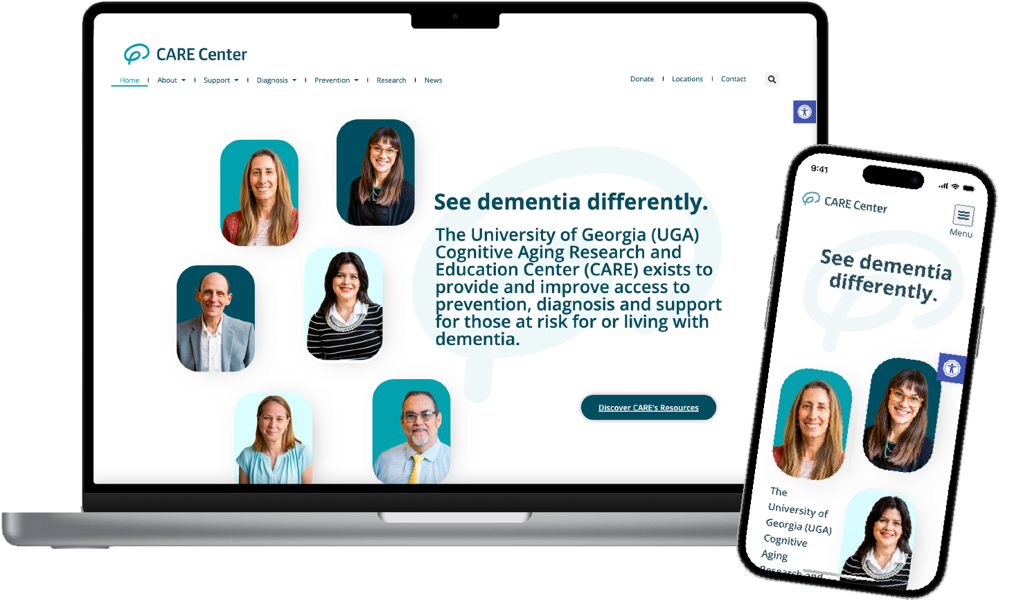
Over the past 9 months the clients’ goals for the purpose of the website evolved, due to this evolution and missing imagery the client did not feel like the homepage reflected their goals. That meant our homepage needed to evolve from featuring representation of what rural Georgians look like to featuring imagery of CARE Center employees. The new homepage is pictured below.
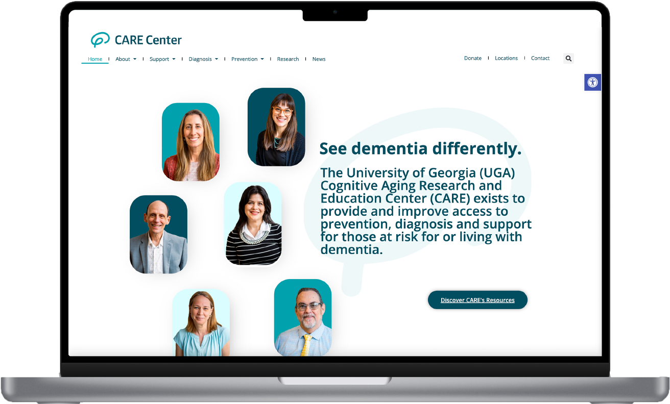
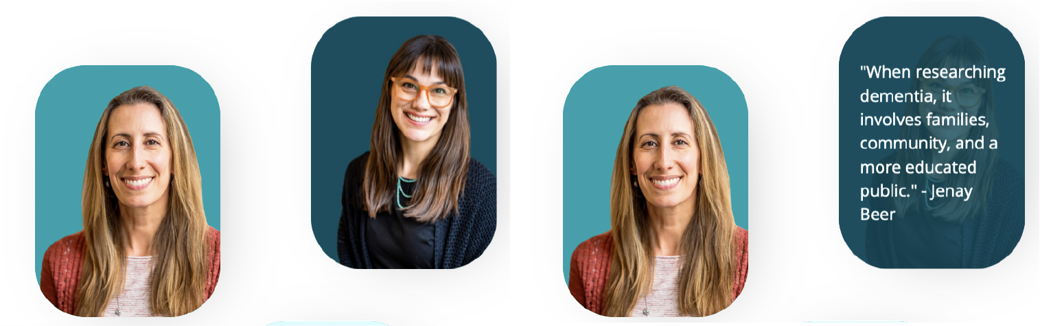
Additionally, the homepage images were turned into flip boxes at the request of the client and have quotes from the person pictured on the back of the image. Another change as a result of client requests and user testing insights, was to move the navigation bar to accommodate the addition of Donate, Locations and Research to the main navigation bar.

With collaboration between our client and team members to get everything exactly right, CARE’s website officially launched in May of 2024. Now, people across the state of Georgia can easily access ADRD resources.
Brain Health Video Series
The CARE Center has an established in-person Brain Health presentation that educates viewers on how to improve or maintain brain health as it relates to ADRD. CARE representatives visit 11 counties in rural Georgia to give these presentations and that’s great. However, the gap it leaves in ADRD education for the remaining rural areas of Georgia where CARE doesn’t have a presence is wide. That’s why we were tasked with turning that in-person presentation into a video series that will be housed on YouTube and CARE’s website.
When we first started the Capstone Project, we felt that the CARE Center needed to be properly introduced before diving into Brain Health topics. So, we created a rough cut for an introductory video stating common misconceptions about ADRD.
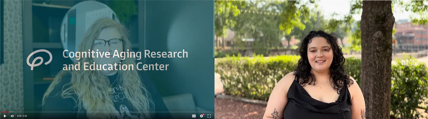
The video’s concept was based on the role hearsay often plays in rural communities. For this video, we storyboarded the idea and set out to film the video’s first iteration with the intention to recast with people from the CARE Center. When we showed the first iteration to CARE Center co-founders Jenay Beer and Lisa Renzi-Hammond they were all in on the concept of adding one video that introduces the CARE Center to the Brain Health video series.
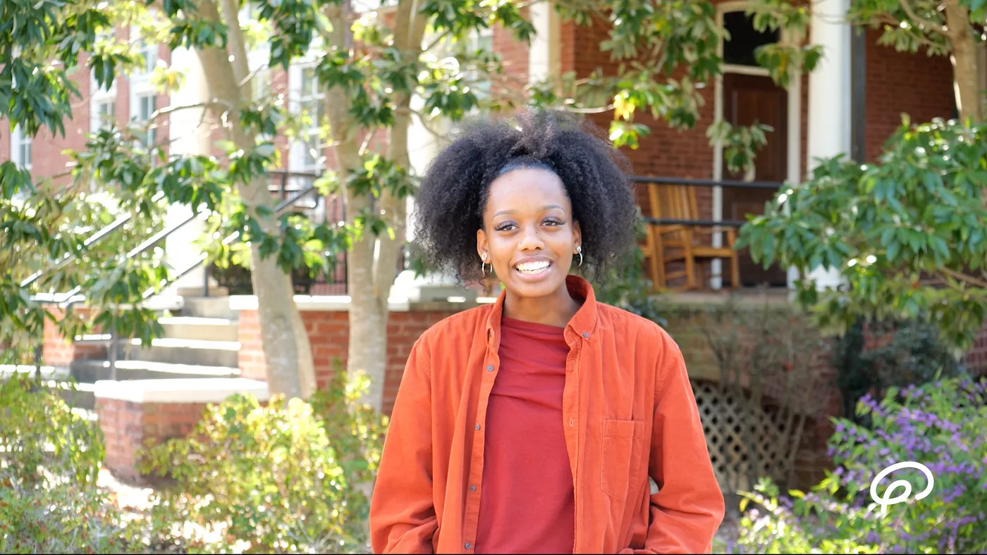
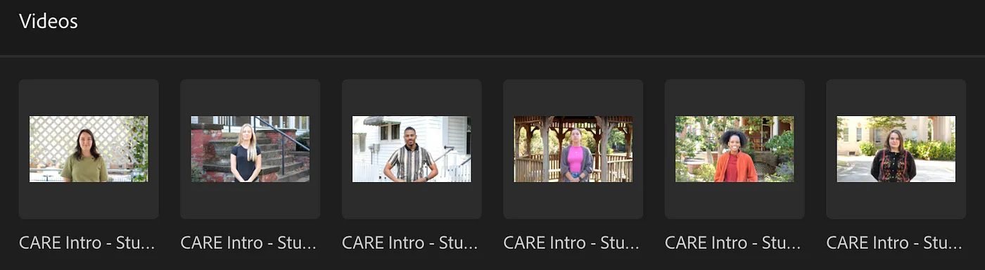
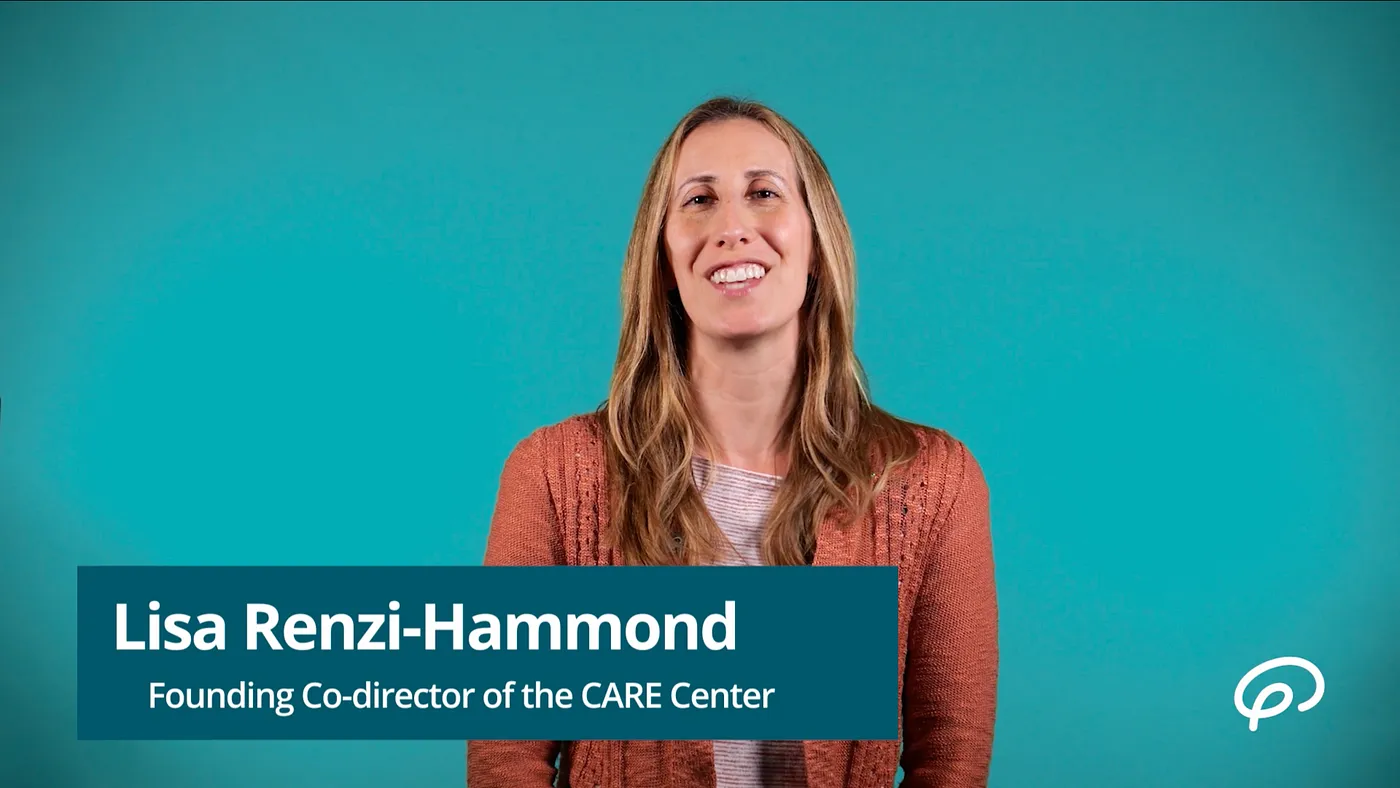
With that suggestion approved, we began working on the concept of the Brain Health video series. We looked towards sources like the Mayo Clinic, TED Talks, Emory Healthcare and other well-known medical institutions’ videos to determine the initial look and feel of our series. What we gathered was that we would need a speaker who was engaging, friendly and knowledgeable on the topics to be the presenter. Instead of using a voiceover artist or actor we looked to the CARE Center to provide speakers due to their intimate knowledge of ADRD topics. We knew that featuring CARE experts would also reinforce the idea of the CARE Center as a source of knowledge.
Before filming, we read through the content of CARE’s in-person Brain Health presentation and decided to divide the series into 7 brain health videos. Our divisions aimed to keep the videos length at 3–6 minutes long. We chose this route because in our user research we discovered that viewers preferred shorter videos instead of longer. The video topics are as follows:
-Alzheimer’s Disease and Related Dementia Beginner
-Non-Modifiable Risk Factors/Modifiable Risk Factors
-Cognitive Novelty
-Sleep & Hygiene
-Stress Management
-Physical Activity and Exercise
-Healthy Diet
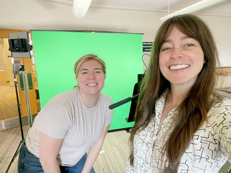
When filming the experts, teammates Amelia and Allison drove to the CARE Center’s main location in Athens, Ga. to record. This involved two visits where we set up a green screen for the CARE experts to stand in front of as they read their individual scripts.
Once the first two videos were filmed, we set about to begin creating a template for the series to follow. Initially we intended for the series to feature motion graphics animations.
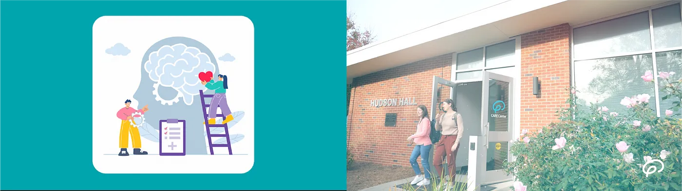
But, we quickly figured out that it would be difficult to maintain a visual theme with the motion graphics selections offered by Envato. Knowing this, we pivoted to using documentary style b-roll.
When constructing the final template for our videos, we relied on CARE’s official branding — specifically the colors — to create a theme that strings together each video with visual elements. Those visual elements consist of a custom made intro/outro, lower thirds that introduce each speaker, a bug that is CARE’s logo, an overlay for all b-roll and an animated background to display text, lists or graphs.
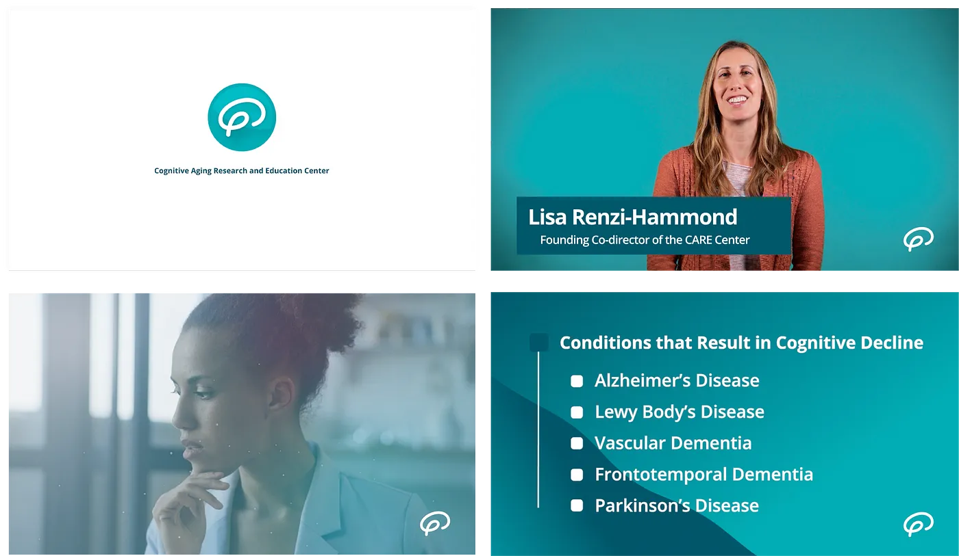
Each video in the series followed the template above. All videos went through a thorough critique from within our team, NMI experts and the clients themselves.
Our hopes for the video series is that it can be repurposed and edited down into clips that are used on social channels. We believe this is completely doable because we’ve already done it on the website. In order to give users a little more context about who CARE is and what CARE does, we included a short portion of the introductory video on the website’s homepage.
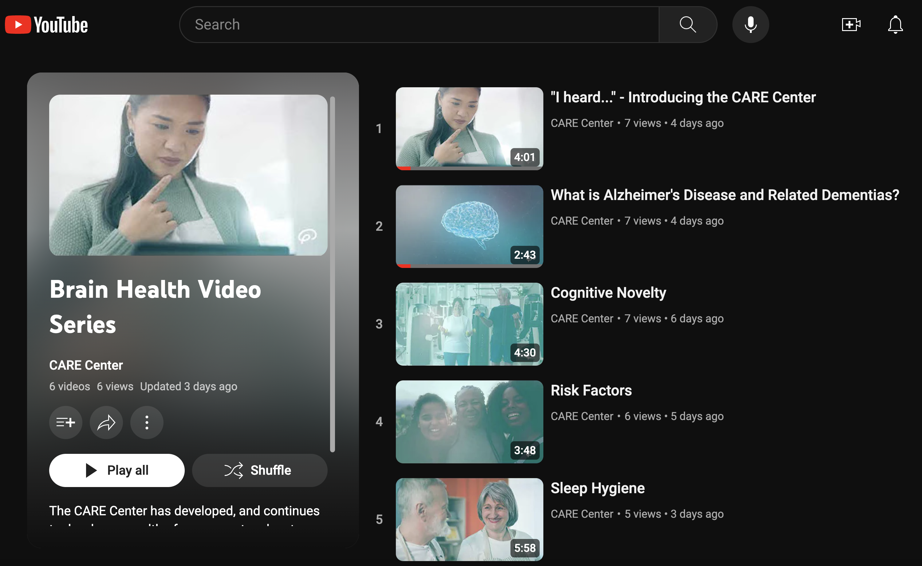
Each video lives on CARE’s YouTube channel, and all include subtitles for accessibility. They were also uploaded to the Brain Health Video Series page that lives on the CARE website.
As the UX project manager, I learned that creating agendas for meetings, communicating designs and planning ahead are all key when you are collaborating with clients and team members remotely. The rounds of user research and testing done for this project further solidified that UX design and research is the logical next step in my career path.
Regarding the project deliverables: through user testing we confirmed that our website and video series were up to our users’ standards.
Next step for our website is to pass it off to the CARE Center to maintain and update — which should be simple given that we updated our Design Kit with all needed information.
Project Website
Video Series
View my team’s Final Presentation: